Facebook & SEO

We had a request on our Facebook feed to talk a bit about SEO. SEO stands for Search Engine Optimization, and in human speak that means getting your website ranked higher on Google. The closer you are to the #1 spot on Google, the better your website will do generally, so most website owners are very interested in this process. The shortest, easiest tip I can give is this:

  • Get other reputable websites to link over to yours. The process is mostly about relationship building, and it can absolutely be worth it.

Since we are currently focused on Facebook, I wanted to list a few ways FB can help you with the SEO process:

  • Facebook clicks and traffic can be very affordable, which makes testing variations of your website very affordable as well. Using Facebook to help you choose your “stickiest” page variant should support SEO efforts at a reasonable cost.
  • ABT, always be testing. Insights you gain on Facebook can easily be ported back over to your website. As a quick example, Meta Descriptions are the bit of text on each listing in a Google results page, and can either help attract more site visitors – or not. Facebook could be used to test and choose between 3 – 5 variant text blurbs for the ideal meta description that will drive more visitors to your site. If you used the method above to pick the “stickiest” design, more of this traffic will hang around.
  • Facebook’s Lead Forms help you collect more email address. Email address help Google AdWords with targeting. AdWords helps SEO in some direct and indirect ways.
  • Facebook can help get additional eyes on your blog content, which would eventually lead to “natural” links from other websites. For example, a “cold outreach” email requesting that I provide a link to another website probably wouldn’t work … but if I found that blog post myself through Facebook, I’d be that much more likely to provide that link. Yet another reason why it’s important to get those likes and increase you reach!
  • Speaking of “cold outreach” to acquire more links to your website, performing this outreach through email is kind of a pain. People have a hair trigger for email spam, and you’re likely to get ignored. Outreach through Facebook can be an effective alternative depending on who you’re going for and how active they are – look for that “message responsiveness” badge on their FB page!
Return of the Web Guy

The Website Guy returns. It’s been a very busy couple of months since I last checked in! Right off the bat – don’t follow my bad example and keep up with your blog. With that said, it’s a forgivable offense if you’re working on building a following elsewhere, which is exactly what this web guy has been up to. 🙂

One of my primary focuses for building up my budding business is local outreach. I have this silly notion of being the Spiderman Webhead of my home town, Virginia Beach. I want the websites of the businesses in my area to be top notch because I know how much it matters to the economy overall. It’s why anyone from the Hampton Roads area should feel free to reach out with any questions – I’m usually giving away great information for free because I’m motivated to improve the digital presence of our area’s businesses and organizations overall.

To meet my fellow local business entrepreneurs, I have been sampling some of Virginia Beach’s local networking groups. Business Referral Network or BNI has been my primary focus, an international networking group that meets weekly. It has been insanely instructive to step back from the national and international clients to focus on some of the most exciting first steps of a building a small business. There’s a palpable excitement in the air …  it’s electrifying. I’m reminded of why my mother (a real estate agent) liked working with first time home buyers so much – it’s such a huge milestone, and I am honored and humbled to play a role in making small business owners’ dreams a reality. Someone pinch me.

Outside of my local outreach, I’ve been busy working on a “meeting of minds” between my brother and I. He is a “web guy” himself, and recently left his place of employment to brave the wild world of freelancing. We have established a joint venture, “The Website Guys”, and we’re initially focused on helping small to medium sized businesses get the most out of the Facebook platform. Being in the #2 spot behind Google, Facebook’s platform gets more attractive every day as Facebook attempts to close that gap. You’ll find more frequent web guy musings on our page there, though now that we’re through most of the startup tasks I plan on blogging more frequently. Long form content just doesn’t do well natively in Facebook, and I’m a wordy kinda guy 🙂

So in closing, if you haven’t already please like our page and follow along https://www.facebook.com/vbwebsiteguys/ ! Thanks!

Technically Artistic or Artistic … Technically

Before going any further in this post, refresh this page. I’ll wait 🙂

Notice how the header image changed? Try refreshing it again.

I can’t exactly account for how “pretty” or not each version may have been for you, but I’m basically grabbing screen shots of one of the first programs I ever wrote back in 1997 in Basic. You can see an actual “moving” demonstration at the end of this blog post. This simple program has a certain significance to me as it was one of several major “aha” moments in my younger days, informing me that programming computers is basically “my jam”.

What really impressed me with programming is that someone without the “visual” artistic capabilities (I’m more of a wordy kinda guy if you couldn’t already tell) could create something visually striking with numbers, formulas, and a general know-how in math. The program basically draws a matching circle in each corner of the display area of a random radius, color, and border thickness – and it does this every tenth of a second. The result is what you see. I could seriously watch that kaleidoscope-esque effect for embarrassing amounts of time.

I’ve been thinking about this program a lot in the fast few weeks, so much so that I wanted to dust it off and give it a more modern home (a web page.) I’m currently chewing on how to bring this design philosophy to life, how to inject more personality into my clients (and my own) web properties. What you are seeing here in this blog post is my very first attempt. The image you see at the top of the screen is a new image, one that no one else has seen or will ever see again once you move off this page. And yet, its not SO random that everyone gets a different experience altogether. Everyone is going to see 4 * 1000 circles, with their centers anchored in the corners of the screen.

My thoughts on improving this over time (progressive enhancement) is to dial back on the randomness somewhat – making more palatable color combinations a virtual guarantee versus blind luck. I also think that adding in subtle responses to user input (mouse movements, etc.) would help increase engagement and time on the page in question. Finally, there seems to be a real opportunity here to utilize this method when both constructing and testing page variants. Humans are limited in the number of versions they can feasibly generate and test; computers are not. The pages that could come out of this kind of approach are … well, limitless really.

Anyway, enjoy one of the first programs ever written by yours truly!

Your browser does not support the canvas tag. This is a static example of what would be seen.

Importance of Page Load Time

When a web visitor clicks a link that leads to your website, there is a symphony of digital activity behind the scenes. The number of handshakes happening between the layers of software across a multitude of machines in fractions of a second would truly astound any onlooker, if such a thing were viewable. We all effortlessly stand on the shoulders of giants when we participate in an internet browsing session, and you get a real appreciation for that fact when learning how web pages are assembled on the visitor’s machine. While we all undoubtably benefit, this complexity is not without its own set of costs for those of us looking to make a living on the web. Without a Maestro guiding the process, the performance can derail into a cacophonous mess.

The time it takes a website to fully display any given page is that page’s “load time.” This delay is due to the awesome process I describe above, a concert of software packages, multiple computers, and a labyrinth of networks. Some “pause” is unavoidable, even for the fastest website. It is our responsibility as “webrepenures” to ensure our websites minimize this delay as much as possible. Our visitor’s time is valuable, and extra seconds between each page add up over time.

I put together a demonstration on page load time. It both shows loading times in action and discusses why we are concerned with longer load times. Definitely check it out if you can, but the bottom line is this: Lengthy load times cost you both in the short and long terms. Short term when an impatient but conversion-ready visitor on a mobile device leaves your website for and goes to your speedier competitor’s site. Long term as major search engines like Google make a note each time something like this happens, deranking you and upranking your competitor’s site. Its not something a serious website owner can take lying down any more.

The crowning example of the importance of page load time comes from Amazon. Through careful study and analysis, they determined that a 1 second delay in their average load time costs them roughly $1.6 Billion in sales! I’m sure you can only imagine what kind of a fire this lit under their collective behind to shave off every tenth of a second they possibly could, using any and every tactic available in the book. Its not some abstract trend that only affects Amazon, everyone who maintains some kind of digital space on the web suffers from the impatience of web visitors.

I always encourage my clients to determine their own “cost of excessive loading.” In this exercise, I assist my clients in comparing the group of visitors who did something “valuable” on their website against those that did not. Using Google Analytics, this is often a quick 15 minute investigation (especially when GA has been configured properly.) The trend is always this: the “valuable” group will have a lower average load time when compared to the “no valuable action taken” group. Though there is certainly a degree of “noise” in that measurement, the trend is still worthwhile to note. With smaller gaps between those groups, page speed optimization may fall behind other digital priorities. Larger gaps between these two groups indicates a strong possibility for lost revenue and organic ranking, and that drafting a roadmap to better page speed performance is most likely in order.

Coding Post #1

In these kinds of posts, I’ll be discussing more of my technical conquests. So if that sounds dreadfully boring to you, take a look here for more of the marketing side of this post.

Boy, do I both love and hate Javascript. It’s easy to learn but impossible to master. It breaths incredible flexibility and power into your website, but only if you know how to work around Javascript’s quirks. As a programmer, I was trained in more procedural languages while Javascript is a blend of procedural and functional. Nerd speak aside, I’m really lamenting my lack of a friggin’ ‘pause execution’ button.

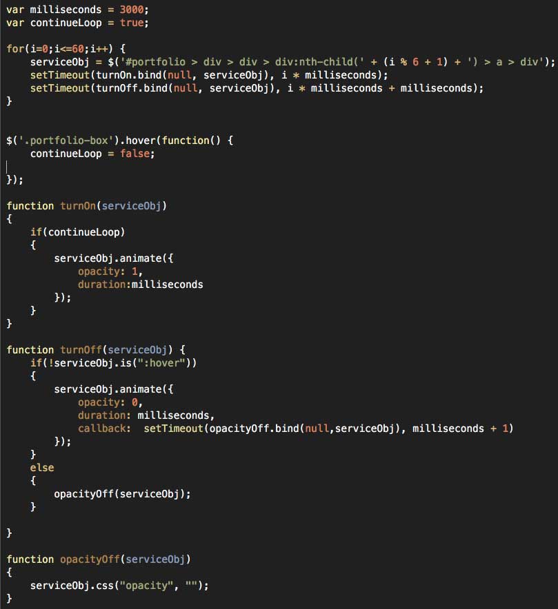
I wanted to make my hoverable images on my service page fade in for 2 seconds, then out for 2 seconds – one at a time. It probably makes more sense to look at it, so check it out here.

Now that you’ve seen it, lets get the code out of the way.

Now I’m going to bullet out some learnings from writing this jank:

  • When dealing with issues of timing in Javascript, you have to remember that the browser is going to rip right through your code, doing all the things you want in a particular timed sequence almost simultaneously. You have to know how to space everything out timing wise, using control loops, timing functions, and the dreaded callback.
  • To help make your life easier, establish your timing variables instead of hard coding them. The way I have written it, I can easily change the amount of seconds the transition takes by adjusting the millisecond variable.
  • One fun thing I learned here was that calling setTimeout with a function that passes variables screws the whole thing up, causing everything to fire simultaneously or just plain not work. Using “bind” apparently circumvents that problem, allowing variables to be passed without issue. Whew.
  • The for loop is set up to basically do 10 (60 / 6 = 10) iterations. To make sure my definition for serviceObj fires correctly, I had to bust out the mod operator so it would remain 1 – 6 regardless of where ‘i’ was.
  • I have an event listener in place for a hover on a .porfolio-box class. When that happens, a “continueLoop” control variable is set to false. This halts the behavior after the visitor has hopefully realized that the boxes are mouse-over-able.
  • I only perform the check for continueLoop in the ‘turnOn’ function. Checking in “turnOff” as well would mean previously lit tiles would stay lit.
  • The ‘turnOn’ function is called every X seconds, where X is the iterative variable multiplied by the millisecond reference variable established in the beginning. The ‘turnOff’ function is called similarly, with extra time built in to account for turnOn’s time needed. Thank you Javascript for forcing me to work on my temporal skills.
  • The ‘opacityOff’ function is meant to remove the inline style that jQuery adds when animating. The original hover behavior from this Bootstrap package relies on changing opacity with external CSS, and since inline styles take precedence over external CSS, the behavior didn’t work unless ‘opacity’ was cleared as an inline style. Once turnOff completes, opacityOff is called to clear the inline style so that hovering still works.
  • If a person moused immediately over the panel that’s currently lighting up, the ‘turnOff’ function was still called, meaning that the panel disappeared even though the mouse was still on it. Not good. Yet another example of Javascript edge cases! Luckily, a quick check for the box NOT being hovered on before ‘turnOff’ is allowed to execute its contents seems to do the trick. This made sure that hovering mid-animation didn’t ruin everything. But of course it also WOULDN’T TURN OFF when the user moused out. So I threw an else condition in the turnOff function for when the box was hovered, setting the opacity to empty which allowed the CSS behavior to take over on mouse out. WHEW.

This was an interesting post for me to write. I certainly had fun with it, but I’m really not sure how much people may or may not be interested in super-geek code style posts. I’ll be keeping an eye on the analytics, so if you liked this, hit the refresh button a few times to inflate those numbers! I promise I’ll work on the lackluster formatting if I see enough interest. 🙂

PS – if you haven’t had a chance yet, check out the “marketing side” of this post.

Progressive Enhancement Post #1

Alright I’m pretty excited to bring today’s post. I’d like to use this category of posts to discuss my approach to progressive enhancement – a term us web nerds use to describe the process of managing and improving a website over time. In today’s post I’ll be using my own site as an example.

The story goes like this: I wanted to establish a blog category on my approach to progressive enhancement. I am a firm believer in letting analytics data determine where enhancements should be made, all tied back to established website goals. I didn’t have to wait very long to spot a concerning trend! As a website owner, you want your visitors to be drawn deeper and deeper into your site. If they are not, it always makes sense to look for bottlenecks and make efforts to remove them.

Case in point, I noticed in my own traffic patterns that while people get to the Services page, they rarely went past the more “introductory” services page. I spent a lot of time pouring over the content for the six individual service pages, so naturally its cause for concern that people aren’t compelled further down the rabbit hole. So with this issue unearthed, I took a look at my services page and attempted to identify potential bottlenecks.

My first thought is to throw the copy right under the bus. Maybe its not that compelling, or my copy is too “sales-y” and not specific enough on what I’m actually offering in terms of services. Though completely plausible, this issue will be addressed in a later enhancement when I am able to set up different variants of this page for testing. If these new service page variants outperform my original here, then we’ll have answered the question “does the copy suck.” Though certainly possible, there may be other reasons …

My second thought is that while its great to have a “graphics grid” with 6 mouse-over-able pictures, that perhaps some visitors might not realize that they are indeed an interactive element to the site, and that I intend for visitors to hover, click, and navigate to the individual service pages. One solution to this problem would be to make the title and subhead appear by default over each image, but that just didn’t seem as fun as what I came up with. It probably makes more sense for you to view it first, so check it out real quick. I’ll wait 🙂

I wanted a subtle “shuffle” effect that would sequentially fade the overlay in over the 6 service offerings images. My thought was that its a subtle enough effect to catch the users eye and let them know there’s more going on here than just imagery. And so as not to overwhelm with too much animation and motion, the second a visitor mouses over an image the whole behavior stops. Its really only there to cue visitors, and once they get that there’s more content, there’s no need to keep it going.

So hey, this might not be the solution to the original problem of people not looking at my individual services pages. But with a quick bit of custom coding, I’ve narrowed the field of potential causes. I am confident that if there are a subset of visitors who don’t realize the images are hover-able, this fix would most likely addresses that issue. Now the only question that remains is was that the actual problem, or do I need to take another pass at the content on the page to make it more compelling? (hint: the answer to this question is always ‘yes’ regardless.) Continuing to monitor the performance of visitors coming to the services page should help clarify the answer now that I’ve hopefully taken the “didn’t know the images were clickable” issue off the table. If I REALLY wanted to be sure, I would treat both pre-treatment and post-treatment pages as variants and split incoming traffic to see if the new page actually compels people deeper into the site for a direct comparison. All that said, since I like the effect, I’m just going to keep it.

In summation for this first progressive enhancement post, this is my approach. Crawl around in the visitor data to see if any interesting behaviors emerge, hypothesize about those behaviors, and make manipulations that serve a dual purpose of improving the site while simultaneously answering some important questions about visitor interaction. A website is never finished, and this kind of approach to the lifespan of your website will ensure you get the maximum value for all you paid for in that costly (re)design phase.

Extra Credit:
I have a follow up post to this one where I talk about the coding side of this solution for anyone more technically inclined.

Send me Your Website Questions!

In this blog post, I’d like to take the opportunity to explore what this consulting business o’mine is really all about. I think of myself primarily as a translator – someone who stubbornly sits on the border of the technical side of the web and the marketing side. Calling myself a “website guy” encompasses nothing less. Acting as a go-between for both fields provides some serious opportunities as I find people are usually strong in one but not the other. At a point in time where the wall between them is shrinking every day, website owners NEED someone like me who facilitate communication between both sides.

So moving forward, I would really like to do these kinds of posts where I answer digital questions specific to people’s context – be they marketers attempting to get the most out of technology, or technologists looking to understand marketing themselves or their products better. So I encourage everyone to submit any question they have and I’ll see what I can do. If its website related, either I know it, or I want to know it. So without further ado, here is the first Q&A style “web chat” post.

Mike, a web and mobile expert dealing primarily with metered paywall based magazine websites, asks a very simple and straightforward question that all small businesses are currently mulling on: How do I get more sales? My answer for Mike’s specific context goes as follows:

Mike,

I took some time to think about your question regarding acquiring more sales for the past few days because I’m in a very similar spot. Our situations are somewhat alike in that we are both young businesses, so it was pretty helpful exercise for me too!

You’ve already taken the first step I would have recommended, which is to pick a specialty area. I understand that you are specialized in issue-based magazine websites that use metered paywalls. I’m also going to make a guess that you deal primarily with WordPress, which makes the next step that much easier.

What I would recommend for you is a WordPress specific theme and / or plugin for metered magazine websites that you & your team author. You are your own client here, which I know can be challenging, but I think its worth it. Here’s why.

The benefits of this approach are many.

  • First off, websites that use your plugin should count as a backlink and will pass off some SEO “link juice” over to you (you may already be aware of this trick.) Having one of the “go-to” plugins for running a magazine style website within WordPress will work wonders for your organic ranking within Google. On the SEM side, the specificity involved here will really let you focus in on some high performing long-tail keywords, and your landing pages should practically write themselves. This level of specificity will make it easier for you to compete with the big guys.
  • Second, it gives you something more concrete to market. Its easier to sell a tool you have been developing that encompasses all the learning you’ve done in your time working in this specific niche. It would be compelling to me as a magazine style website owner to know that the software I am acquiring reflects the learnings from other domains that use your software, especially if you have performance numbers to back up your claims. It also gives you something to demonstrate in your one-on-one sales meetings rather than just TALK about how good you are in this particular area.
  • Third, you get a unique opportunity to craft the software in a way that not only reflects your unique style and capabilities, but also gives you a baseline product to impress your clients with right out of the gate. Why start with nothing in every client relationship when you can deliver early value right in the beginning? Then there’s an upside for you in the duration of the relationship as well. It simplifies the service questions – from “how can I help them” to “how can I modify my tool to help their specific context even more than it already is?” AND, if the further modification would help your other clients / subscribers, you could easily adapt and abstract the new feature for more generic use.
  • Fourth, you could build your own magazine style website that demonstrates what your software tool can do for potential clients. It can be as real or as fake as you want. Its a sales tool. You will be able to take more liberties with your own magazine site versus one of your client’s, so this will be a testing ground of sorts. And who knows, if your magazine site became popular, another source of revenue never hurt anyone!
  • Fifth, a software package can be scaled where a business that revolves around servicing clients can’t be scaled easily. If your web-solutions business takes off, you may find it especially difficult to maintain the organization you enjoy now as a smaller business. Once these organizational cracks start to show, you’ll realize you’ve hit a ceiling of sorts. While software certainly has its own set of scaling issues, its my belief that they are easier to manage and happen further up the revenue chain – i.e., software scaling issues are usually cause for celebration!
  • Finally, there’s nothing stopping you from acquiring work outside of this niche, just think of this as where you will apply most of your marketing effort towards. Once you are comfortable that you have a marketing mix that sells your product to the utmost, you can then revisit this very strategy for other areas of competency, like perhaps adapting your software for ad revenue specific magazine sites versus metered.

I hope this helps, Jay! I know the exercise was certainly helpful for me to think through. If you have any further questions, just let me know!

First Web Build Launched

Working on your own website can be tough. After finishing up my “sprint” to get a website in place for my new consulting business, I thought back on the process through the eyes of a potential client. It was actually one of the things that really helped me move quickly – as a web developer I want the BEST code, I want neat and orderly organization of my web files, and I want a thousand cool demonstrations of my web capabilities in place before I launch my website. In this case though, my need to have a website in place outstripped my need to have an entirely custom, super organized website packed to the gills with features. All of that can and will come through progressive enhancement. I had to keep thinking of myself, somewhat abstractly, as a client who needs a website up yesterday. It was extremely helpful exercise to help me push past my perfectionist coder side.

So my website right now is a combination of WordPress and Bootstrap. Very briefly, WordPress is a “content management system” that allows for fast blogging, content updating, and a general method of organizing a website. Bootstrap is a framework that provides fast prototyping of mobily-responsive websites and grid based design that “doesn’t suck” (like HTML table based design from ’99.) The Bootstrap folks provide some great template packages, so I grabbed a few and set out to Frankenstein everything into something usable for my first website build.

In an ideal world. I’d have as many hours as needed to build everything on my own, to control every last line of code. It’s a somewhat outdated mindset, but I have found some serious advantages to having the “build it all myself” mentality. If a developer is willing and able to do all of the work themselves, if the desire is there, then every packaged template has to compete with the brilliant but totally imaginary code envisioned. The bar gets set pretty high.

I’m pretty happy with the final result – roughly a week or two to get something in place is pretty great. Though I am very eager to “roll my own” website, this is the kind of agility you can get away with when you work with the raw stuff. I’m a committee of one, extremely agile and able to pivot with my site very quickly. Its taken me some time to move from the code perfectionist to the agile, get SOMETHING in place now and improve-it-over-time guy, but the transition has been totally worth it.

This is what you need in a web guy, a blend of old and new. There’s a school of thought that stretches development time out to make sure all the i’s are dotted and t’s are crossed, which is sometimes important but often unnecessary. In some cases, developers find a portion of their project already outdated when finally released! You need something in that happy medium. If you’re not on board with a progressive enhancement approach to your web presence, it’s time to consider a new way.

First!

Welcome to my first blog post! I should probably call it a “labs” or “laboratory” post, but I’m not trying to disguise what this section of my website is. All websites (that want to be successful) need a section like this in their website. The premise is simple – show Google (and other search engines) that your site is kept “fresh”, updated with new content regularly to keep visitors coming back to your website.

It sounds nice in theory. But as with many things on the web, once the idea has taken root, the tactic becomes that much less effective as pretty much everyone else is doing it. So now the race is on the content itself – be funnier, share more wisdom, invoke more emotion, tell a great story, all at the same time and BETTER than everyone else attempting to do the same thing.

All this sounds pretty daunting – I chuckle as I write this, no pressure or anything, right?? This is why I’ve titled this section of my website “The Digital Laboratory”. If you want to pour time and effort into your blog, you’re better off trying to come at it from an angle that showcases your unique voice. My plan is to “show, not tell”, as is often required with web work. This area will be used to showcase not only blog posts, but web tools that I build or active demonstrations of what all can be done with a website. So keep an eye on this page, check back every now and again for some demonstrations of the crazy web capability I can provide.